Back to top
Mijovi
Branding
Location
New Brunswick, New Jersey
Client
The Mijovi Company
Designer
Richard Poulin
Publications and Recognitions
Creative Quarterly
Graphis
Previous
Next
© Poulin + Morris Inc. All rights reserved 2017.


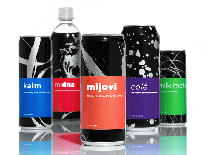
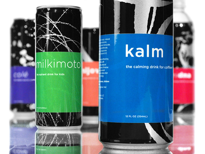
To capture the spirit and unique flavor of Mijovi and each of its products, the Poulin + Morris team created a series of simple yet unique visual metaphors for each brand message. The new packaging program relies upon a sophisticated, timeless approach that uses distinct textures combined with bold typography and bright colors. The end result creates visual impact so that each product stands out among extremely crowded beverage shelves while communicating the essence of each brand. The imagery is metaphorically derived and symbolizes the spirit of individuality, energy, and self-expression.
The project was recognized by Creative Quarterly and Graphis for Design Excellence in Graphic Design.