
Back to top
JP Atlanta Restaurant
Branding
Digital Media
Print Media
Location
Atlanta, Georgia
Client
Portman Holdings
Publications and Recognitions
Graphic Design USA
Graphis
Society for Experiential Graphic Design (SEGD)
Previous
Next
© Poulin + Morris Inc. All rights reserved 2017.


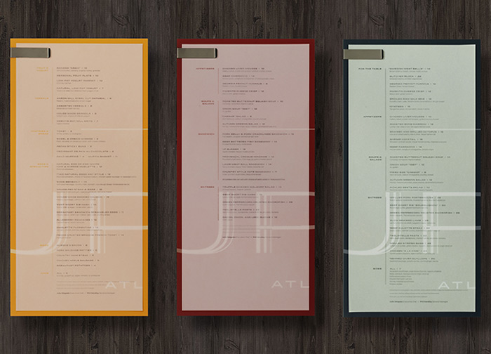
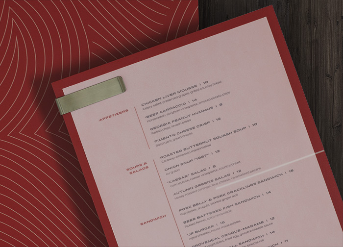
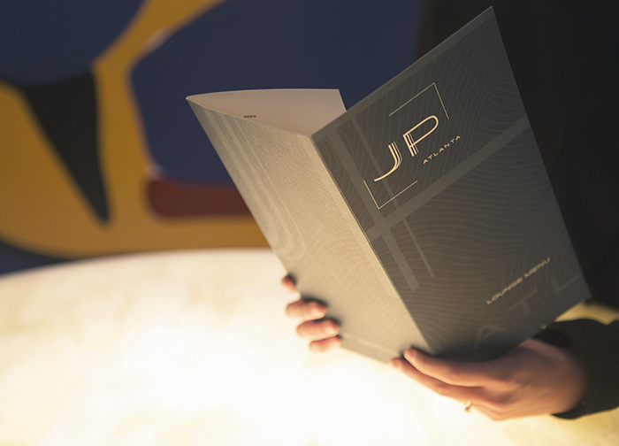
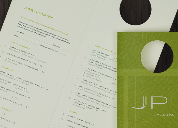
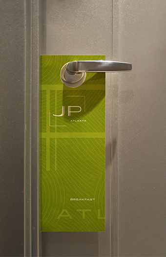
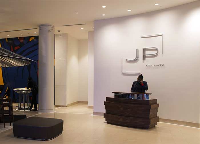
Poulin + Morris collaborated with John Portman & Associates in developing a comprehensive branding program for the new restaurant. The JP Atlanta logotype utilizes the same mid-century modern inspired typeface used in the environmental graphics and wayfinding program newly created for 230 Peachtree. The restaurant’s print material, including menus, gift cards, stationery, coasters, and packaging, features “JP” framed within brackets and set against a dynamic background of enlarged, abstracted letterforms of the logotype. A sinuous, line pattern taken from the restaurant’s custom carpet appears on clipboards and is visible through transparent, vellum menus which are printed in 3 different colors pulled from the restaurant’s interior color palette differentiating breakfast, lunch, and dinner offerings.
Poulin + Morris has continued to work with JP Restaurant in developing brand and website design guidelines as well as a branding program for JP Kitchen, a grab-and-go venue for the business traveler. Plans are also underway for expanding the JP Restaurant brand to hotel properties located in Denver, Colorado; Charlotte, North Carolina; and San Diego, California.